 The folks at Freestyle Komics kindly reached out to us and asked us to review some of their books!
I love this kind of stuff! Let me say, I’ve had a comic book story (4 issue limited series, probably) in my head, for a little over a year. Nothing special, at all. Nothing ground breaking. Just a comic book idea I have scribbled for a plot; but lacking any form of artistic ability (and time to do much else), the story will probably remain stuck in my head forever. So I love seeing when others get out there and they make their comic dreams come true, any way that they can! Because these are the people I wish I could be; so when I am given a chance to read and help promote their work, I love doing it when time permits! (I am back logged at the moment with other books I need to get around to doing the same for!)
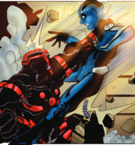 Let me talk about Hotshot first. Now, first of all, reading two issues in – I am not too clear on exactly what his powers are (aside from flight, and super strength, and some other unusual powers!) The villain looks like a villain, acts like a villain, and seems like a genuine threat to everyone and everything (especially Hotshot who he is out to kill!) The art is clean (although the beginning of the second issue has a few of the first couple pages that seemed a tad rushed, but the art cleans up soon enough!) The writing is very fun, very well thought out, and the pacing is just about perfect each and every issue. These guys love to end issues with a cliff hanger, so that you’re immediately grabbing for the next issue to see what the heck is going to happen next! The art, throughout the issues (especially in issue #3) is just superb! Very professional looking. (My only trivial qualm is how Michael’s girlfriend is drawn; she always looks like she has porcupine hair! But it’s an artist flair and style, and I get what they’re going for!) I would strongly recommend checking out their site (all linked at the bottom) and seeing if you can get your hands on these!
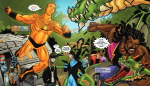 Next I want to talk about Heroes International. Now if you’ve seen any of my reviews on any comics, I always talk about how I am a “team comic person.” There’s exceptions of course; Captain America, Thor, Spider-Man (well, back in the 80’s, not so much anymore for me). Heroes International is a great team of some very interesting, and some very diverse characters, with diverse powers as well. The book does a great job of establishing personalities and power (explanations) for the characters throughout the book. Crag stuck out for me, as probably one of my favorites on the team, along with Hue-Man and his puns (as he changes colors and adapts to situations). The art throughout this entire series remains crisp, clean, and rock solid. One of the nicer things is that not all the characters have that “perfect, superhero build” – for example Titan, is not “built” like your ideal superhero; so it’s nice to see some more… realistic looking people who are also superheroes. The writing, as I said, does a great job of giving you introductions to these characters, and gives you early ideas of what you’re headed into.
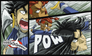 Next on the list is Emerald Forest. The entire book has an anime artist feel throughout it (and most who know know that anime art is generally not my cup of tea). However, I can still appreciate the things that I may not enjoy myself, for their sheer artist talent – and the folks on the issue of Emerald Forest have talent in spades. (I had an issue where multiple pages throughout the first issue duplicate themselves; so once I realized that, I just skipped a page and life made more sense! Kept thinking I was in The Matrix… “Whoa… Deja Vu…”) The story is enjoyable, the art (anime and all!) is super sharp and clean. I think just about anyone could enjoy The Emerald Forest.
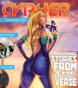 Next in line, we have The Cypher – now, here’s where, for me, anyway, things took a slight turn. Now the cover, to any straight guy, would be very appealing, right? (Whoever did the cover, I feel like they borrowed inspiration for the face and hair, from the cheerleader from Heroes, while the rump is borrowed… from JLo, and maybe that’s why she has the name JFab?) For me, while the story was pretty cool – the art wasn’t doing it for me. But hold up – hear me out! The artist is actually very talented. The art throughout the issue is consistent, clean, sharp, and professional looking. So what’s not to like then, you ask? (And let me be clear, when I say I didn’t like it – it’s not that I didn’t like it – it’s just it wasn’t for me). You see, our main character (seemingly at least from the first issue), is a regular woman by day, superhero by night (or whenever the need arises). Which is cool.
 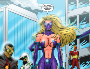 Great to see strong, powerful women in comics. Give the ladies in the comic book world someone to look up to, like Wonder Woman. However… this is where I think it falls short, because of the art. You see, when she is in her “regular” clothes, every panel her nipples are on full blast, like they were detecting water, like the ends of a dowsing rod. And then, when she gets into her super hero attire, it gets “no better.” She’s literally wearing something that somehow is just covering her nipples from her super sized ample breasts. If they … filled out the front of her costume… er, filled it out with an actual costume, and toned down the breasts and nipples, I think this is a book that even most girls would enjoy without scoffing at the artistic style that seems to target young teenagers who aren’t quite old enough to purchase adult magazines.
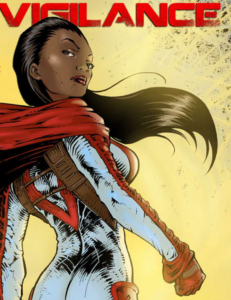 But fear not! All is not lost! Because next we’re going to talk about Vigilance. Now, while I may have been a bit harsh on The Cypher, all of that goes away when I talk about Vigilance. She is everything I complained that The Cypher wasn’t. She’s a strong (literally!) female hero, who does heroic deeds, and it’s shown – she even saves cows and children! She reminds me of a female Superman, except the first issue, goes in hard to show you she’s here to be the hero that everyone needs, wants and can look up to! Heck, there’s even a panel in the first issue that tells you this!
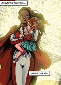 The art for Vigilance has a rough look (not rough as in bad, but the art is dark and edgy – so I mean that in a good way!) Her costume is wonderful; it’s a great design. The characters in the book flow very well. Everything is nicely paced throughout. This really is everything that I had hoped The Cypher was going to be when I saw a striking woman on the cover.
The best thing about all of these books? These aren’t just one off books. All of these books happen in the same universe, so throughout the series, you will see references to – and sometimes, other characters – from the other books! So the fact that this is all a shared universe only adds to the charm and charisma of these books!
Do me a favor – go support these guys! How? Well let me get you their detailed information! I recommend checking them out on: Facebook, their website, blogspot, their patreon, and finally, their twitter!
- Tawmis
